Tools CorrelationMap
Table of Contents | Previous | Next
Correlation Map Tool
The Correlation Map is a tool that shows the degree of correlation among the variables after you have loaded x block data. You can show the degree of correlation before you preprocess the x block data or after you preprocess the x block data. In addition, you can show the correlation among the variables in one of three ways:
|
Option |
Description |
|
No variable reordering |
Variables are plotted in their original order. |
|
Correlation reordering |
Adjacent variables will have the highest degree of positive correlation when variables are regrouped by similarity. |
|
Absolute value reordering |
Adjacent variables will have the highest degree of positive correlation and/or negative correlation when variables are regrouped by similarity. |
To create a correlation map, on the Analysis window main menu, click Tools > Correlation Map, and then select the way in which you want to order the variables.
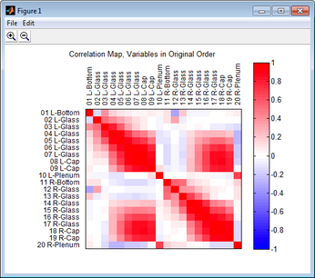
The figure below shows a correlation map with the variables in their original order after default preprocessing methods were carried out on a 200 x 30 DataSet for a simple PCA model. The color and intensity of the off-diagonal elements indicates the correlation among the variables. For example, in the figure below, variable 18 correlates well with variables 7, 8, an d 9 but it does not correlate well with variables 4 and 5.
- Example of a Correlation map
To zoom in on an area for viewing, click the Zoom in icon ![]() . and then drag your cursor around the region of interest. A box is formed around the area that being reduced for viewing. To zoom out on area for viewing, click the Zoom Out icon
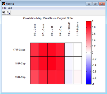
. and then drag your cursor around the region of interest. A box is formed around the area that being reduced for viewing. To zoom out on area for viewing, click the Zoom Out icon ![]() and then drag your cursor around the region of interest. A box is formed around the area that being enlarged for viewing. The figure below shows a region that was reduced for viewing. In this figure, the correlation of variable 18 with variables 7 and 8 is much easier to ascertain.
and then drag your cursor around the region of interest. A box is formed around the area that being enlarged for viewing. The figure below shows a region that was reduced for viewing. In this figure, the correlation of variable 18 with variables 7 and 8 is much easier to ascertain.
- Example of zooming in on a Correlation map

